
Sony Xperia U review
The Sony Xperia U sits at the cheaper end of Sony's range of Android smartphones, using similar styling to the much larger Xperia S and the slightly larger Xperia P and Xperia Miro, setting it apart from Sony's rounder phones, including the rugged Sony Xperia Go and budget Xperia Tipo.
The Sony Xperia U is the smallest of the three handsets, offering a 3.5-inch TFT display inside the same angular, black case as the Xperia S and Xperia P, and an odd transparent plastic strip acting as part design feature, part information panel and part silly light-up novelty.
Prices are relatively modest for a modern smartphone that says "Sony" on it, with the Xperia U popping up for £189 in the UK, or $340 in the US, SIM-free. But can you really get the style of the Xperia S on a budget?
It's pretty close. The Sony Xperia U is small and solid, offering much the same in balance and build quality as last year's excellent Sony Xperia Ray, with Sony putting three capacitive touch buttons beneath the display, indicated by tiny silvery dots.
There's an explanatory icon embedded in the transparent strip, telling Android newcomers these buttons are, from left to right, Back, Home and Menu.
The touch areas are big and very sensitive to presses, meaning it's easy to use the phone without thinking too much about your actions or having to aim your button stabs.
The smaller 3.5-inch display makes the Sony Xperia U fit the hand well, so one-handed use is possible with ease, too.It's pretty close. The Sony Xperia U is small and solid, offering much the same in balance and build quality as last year's excellent Sony Xperia Ray, with Sony putting three capacitive touch buttons beneath the display, indicated by tiny silvery dots.
There's an explanatory icon embedded in the transparent strip, telling Android newcomers these buttons are, from left to right, Back, Home and Menu.
The touch areas are big and very sensitive to presses, meaning it's easy to use the phone without thinking too much about your actions or having to aim your button stabs.
The smaller 3.5-inch display makes the Sony Xperia U fit the hand well, so one-handed use is possible with ease, too.There's also a proximity sensor up here so the phone knows if you're holding it to your head and can dim the screen accordingly.
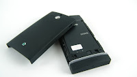
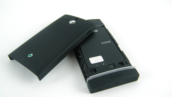
The sides are black with rather flimsy and plasticky buttons, with the 3.5mm headphone jack up top and the USB connector top left.Inside the Sony Xperia U sits a full-size SIM card slot, although there's no SD support in here, so you're stuck with the relatively tight 4GB of accessible storage space Sony has put in here.
 That's a bit of a shame, but at least the battery is replaceable, which will earn the Sony Xperia U some brownie points in this age of sealed, non-accessible phones, such as the iPhone.All of this comes together to give the Sony Xperia U a quality, well-made feel, that apes the design of the high-end Sony Xperia S well.
It feels tough and durable, the display and buttons are sensitive, while the smaller 3.5-inch screen is bright and clear, so much so that it could be considered a
 InterfaceThe Sony Xperia U arrives running Android 2.3.7, sporting the same Sony user interface skin we saw used to such great effect in the very pleasantXperia S.
Not much happens on the lock screen, although if you're playing music you do see a little play/pause and skip section appear where the clock is, giving you some quick-access music control, which is handy.
However, given that the world has gone privacy mad, the lock screen does come with its own little settings screen, where you can dumb down the amount of stuff that appears in its notifications area, should you work in a place where your fellow employees are particularly nosy.

Pinching the display pops up Sony's overview mode, which breaks out all the widgets you have on your various home screens and pulls them together on the one screen.
Pressing one takes you to its screen. You'd probably be better off just scrolling to its screen in the first page, seeing as there are only five to manage here, but it's a nice enough little visual touch.
Open her up and you get those five home screens to play about with and populate with your own choice of widgets and icons.
A long-press anywhere on an empty bit of screen brings up the customisation window, from where you're able to add app shortcuts, interactive widgets, pick from a selection of pre-installed Sony visual themes or create folders to stick yet more app shortcuts in.
worthy replacement for many bigger, more costly Android models.It's a nice-looking, functional widget we'd happily use, although scrolling and managing the little active window and settings on the Sony Xperia U's small screen can take some concentration. Plus it never feels like it's actually updating as regularly as it should.
This rather drab, marketing-led home screen also greets you upon initial boot, featuring a link to Sony's own video store, a shortcut that encourages you to download its Music Unlimited app, plus the useful Track ID system, which cleverly identifies tracks then enables you to buy them.
TrackID can stay, the rest are off into the waste basket.
And that's what happens when you long-press on a widget or icon and drag it up to that little integrated Facebook strip along the top.
 If it's downloadable by others, the Sony Xperia U generates a status update, complete with a shortcut to the app's Play Store listing.
Handy for sharing things. Also handy for annoying people who don't care what apps you have on your telephone.
No comments:
Post a Comment