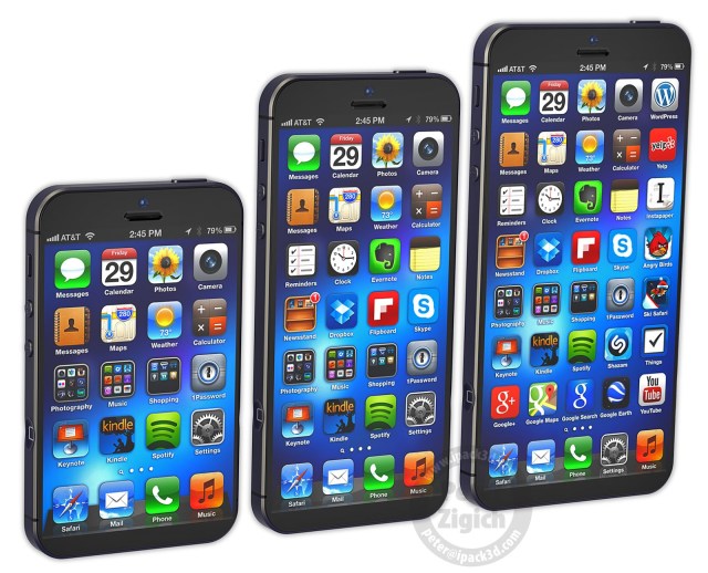
Big screens are the talk of the town at MWC. Got nothing else to announce that makes your handset stand out from the crowd? Throw a huge screen on the sucker. Or just put phone features in a tablet and call it a day. Apple seems to be the only smartphone OEM out there without a giant-screened smartphone, but designer Peter Zigich has created a concept of what a Cupertino phablet could look like, should Apple ever feel the need to big it up.
In a new blog post, Zigich envisions a number of different concepts for a next-generation iPhone, including a design that gains screen real estate simply by shifting the home button to the side of the device, clearing the entire front for display. That adds an extra row of apps, above and beyond the five plus dock available on the iPhone 5. A recessed, side-mounted home button actually makes a lot of sense, especially with one on each side for convenience/ambidextrous use, as Zigich has placed them in his mockup. Would Apple actually add a button to its design in the real world though? Never, say I.
Zigich’s basic iPhone 6 redesign borrows cues from the iPad mini to reduce the size of the bezel around the display, which is feasible if Apple integrates its accidental screen edge touch filters to the smartphone. The designer also employs the same tricks in developing an iPhone mini concept, and what he calls an “iPhone 6 XL,” or an iOS powered equivalent of a Galaxy Note-style handset with a big ol’ screen.
With his nearly edge-to-edge screen, Zigich says that his concept is still perfectly usable with one hand, which has been a sticking point for Apple in the past, at least in terms of the public line it has taken regarding bigger displays on smartphones. And the squat iPhone mini uses the same size screen as is found in an iPhone 4/4S, but in a much smaller package thanks to the new placement of the home button(s) and the shrunken bezel elements.
These concepts are excellent in that they don’t venture too far from Apple’s current design, making them look and feel like something we could actually see out of Cupertino, but despite their merits I doubt we’ll see Apple unveil very similar designs at any upcoming event. Still, with rumors of different screen sizes and new iPhone SKUs flying, it’s interesting to see a material take on how exactly Apple might go about that kind of product differentiation.


No comments:
Post a Comment