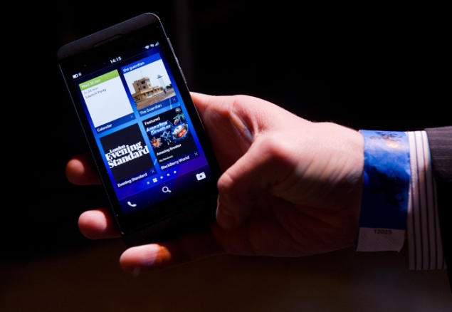
 The word BlackBerry has always been synonymous with emails but somewhere along the line (read with the introduction of the iPhone), the company lost its way and found itself sidelined in the smartphone race, currently being fought by iOS and Android.
BlackBerry 10 is likely the company's final throw of the dice to regain relevance and offer a viable alternative to iOS and Android. The OS has been designed afresh from the ground-up and is built on the QNX platform that Blackberry acquired. The UI has been refreshed as well, and the stock apps like BBM now come with additional features. But does all this translate into a great smartphone experience? Let's find out.
Setup
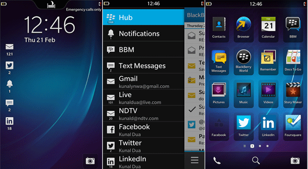
We received our BlackBerry Z10 unit in powered off state and we have to say we didn't really start off on the best of terms. The unit took over 2 minutes to show us the welcome screen - insert BlackBerry boot times jokes here. Subsequent restarts were only slightly better.
The OS goes through a series of welcome screens to setup the phone. Language, Wi-Fi, Agreement, followed by the option to sign-in to your BlackBerry ID, or sign-up if you don't have one. Next up is the screen to enable Diagnostics/ Location data followed by Software Updates option. Finally, you see a tutorial that guides you through the main gestures that you'll need to navigate your way through the OS. You can swipe up to go back to the task switcher/ home screen from anywhere, or swipe to the left to reveal the BlackBerry Hub.
We then went on to setup BBM and add Facebook, Twitter, LinkedIn, Exchange, Outlook.com and Gmail accounts. The whole process from first boot to this point took us around 25 minutes.
Every time you launch an app, the focus first switches to the task switcher and then the app is launched. This gets annoying very quickly. The task switcher is a giant grid of recently used apps, that can also be used to kill apps manually. It is limited to 8 most-recently used apps.
Hub and Peek
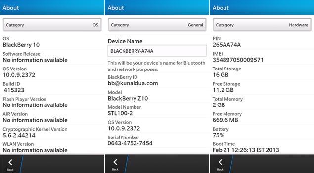
Hub is the centrepiece of the BlackBerry 10 experience, the place where all your notifications sit. It also serves as your communication centre, so this is where your email and BBM go. Think of it as a giant unified inbox.
Twitter and Facebook notifications show up in the Hub as well, and clicking on these, strangely, doesn't open the respective applications, but opens a Twitter/ Facebook mobile interface that lets you choose an appropriate response to the alert. Perhaps the idea is to let you do stuff without ever leaving the Hub, but we really wish clicking on notifications took us to the apps, like other platforms do (not that the apps themselves are anything to write home about - see below).
There's no standalone email client since, you guessed it, the Hub is there for all your email needs. We configured an Exchange account, a Microsoft Outlook.com account and a Gmail account, and the setup was pretty straightforward with options to sync Calendar and Contacts in addition to email.
The email experience was pretty good, and you don't expect anything else from a BlackBerry. However, a few things, like selecting multiple messages for example, take one click too many. There seemed to be no way to do a select all messages either. We hope to see this evolve as we go along.
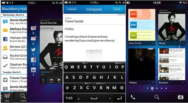
Push email over IMAP accounts does not seem to be supported either, not even for servers with IDLE support. These accounts default to checking email every 15 minutes. We did like the individual control over different email account settings, including the ability to set a different signature for each account, especially handy if you mix work and personal accounts (who doesn't). Are you watching Apple?
The Hub also includes BBM which now includes the useful video chat option (only over Wi-Fi), as well as screen sharing support. A separate BBM icon is included on the home screen as well. There's good news for users as they no longer require a special BlackBerry plan to use BBM - it works fine over normal 2G or 3G data and even Wi-Fi.
Peek is BlackBerry's answer to the Notification Centre that feels nice in the beginning, but ultimately leaves you wanting more. Swipe slightly above from virtually anywhere to take a sneak peek at a bunch of icons with numbers besides them, indicating the unread count. Icons with a red star next to them indicate new content since you last took a peek.
This feels handy at first but ultimately, without a preview of the email we just got, or an indication of who just sent us the DM (or if we were mentioned by someone), the novelty wears out pretty quick. Sure, Hub is just a swipe away, but with all the accounts in there it can get a bit overwhelming, and there's no way to quickly figure out the email that just came in.
Overall, Peek, and especially Hub, are nicely done and easy to get to, but we wish there was a Notification Centre we could fall back upon if needed.
Keyboard
For a company that built its reputation around its QWERTY devices, BlackBerry has been talking up the BlackBerry 10 soft keyboard up quite a bit. Once you start using the device, you realise why.
The BlackBerry 10 keyboard is a joy to use thanks to the autocomplete options that pop up over the keyboard as you type. Simply flick over the desired word gently and the OS types it out for you followed by a space. The best part is that the OS learns your typing habits as it goes along, so even words not native to your language will show up eventually - 'Hinglish' users would really appreciate this feature.
However, a slightly annoying problem is that the autocomplete words appear all over the place and not at one particular spot on the screen. This can take a bit of getting used to. However, that's nit-picking over what is definitely the best stock keyboard across all platforms. We expect to see a lot of people with smiles on their faces as they gently 'flick away' on their BlackBerry 10 keyboards.
Text selection is another thing we couldn't get used to. No matter how hard we tried, we just couldn't accurately position the cursor in order to copy paste text. Based on the feedback we've received, we were not the only ones.
Contacts
BlackBerry 10 pulled in our contacts from Outlook.com and Gmail accounts (we didn't have any on Exchange), as well as displayed our Facebook friends and the people we follow on Twitter. The OS was smart enough to figure out when the same person was listed on multiple networks and 'linked' (merged) the cards. The option to manually link cards in case the OS wasn't able to establish the connection is especially handy, and another feature iOS could learn from BlackBerry 10.
Installed apps
BlackBerry 10 comes with Twitter, Facebook, LinkedIn, Foursquare, Dropbox and Box.net pre-installed. Most clients are pretty barebones, and look like wrappers to a mobile interface rather than full-fledged apps. Most users will be satisfied with the experience, but if you're used to feature rich clients on other platforms, you'll be in for a disappointment.
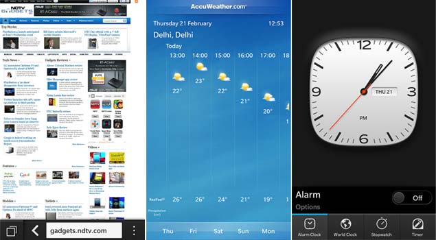
The Clock app is nice, with a really intuitive way to set the alarm, and we loved the Weather app as well. The Calendar app seems solid, similar to stock apps on other platforms. DocsToGo offers basic Word, Excel, PowerPoint viewing and editing.
BlackBerry World
BlackBerry claimed over 70,000 BlackBerry 10 apps on launch day, and once you login to the BlackBerry World (no longer called BlackBerry App World), you do see a wide variety of apps listed. While most apps seem to be just making up the numbers, you do find apps that work pretty well.
Gaming, a category you don't usually associate with BlackBerry, is pretty well represented, thanks mainly to the effort BlackBerry put in getting third-party developers on-board. You'll find a lot of popular gaming titles in BlackBerry World, including the latest edition of everyone's favourite game, Angry Birds Star Wars.
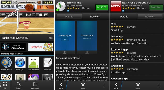
App discovery is a problem, especially with lot of apps just making up the numbers as mentioned earlier, but we expect that to get slightly easier as more users from more markets start using BlackBerry World, and the best apps start rising to the top.
Some of the notable third-party apps missing as of date include Skype, Google Maps, Gmail (if you prefer a dedicated app), SkyDrive, Instagram and Flickr. We also faced the problem of corrupt downloads a couple of times, but re-downloading the apps fixed the problem.
By the time you read this, BlackBerry World in India would have added Music, Movies and TV Shows, but these weren't live in time for this review. We'll update this story with our thoughts in due course.
Maps
Unfortunately the Maps app is nothing to write home about, especially in India. If you've come to rely upon your smartphone for finding your way around, BlackBerry 10 isn't ready for you yet. We hope this gets fixed at the earliest, since Maps are a critical part of the picture, as Apple found out first hand not so long ago. However, BlackBerry claims that the latest version of MapMyIndia maps for BlackBerry will be available free of cost to all customers. This should come as a big relief.
Browser
The BlackBerry 10 browser is updated with a WebKit-based engine and HTML5 support. It does a decent job rendering websites and, on the BlackBerry Z10, felt pretty snappy. The browser comes with Flash disabled, with a prompt to turn it on when you visit a website with Flash elements for the first time.
Miscellaneous
Most apps feature a Share hub, that provides a standard sharing framework to most common sources like Twitter, Email etc. even to third-party apps.
BlackBerry has also improved the desktop software quite a bit, especially on the Mac. You have the option to sync content with your iTunes/ iPhoto libraries. The device simply mounts as a storage device you can access in Finder/ Explorer, even over Wi-Fi.
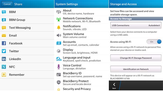
The Settings app is pretty much you would expect. We especially liked the reveal password option under email settings.
BlackBerry Protect is now built-in to the OS and lets you locate and remotely wipe your device in case it gets lost.
For the Camera app review, check out our [BlackBerry Z10 review].
Verdict
BlackBerry 10 OS is clearly a 1.0 release. There are plenty of rough edges, and the app ecosystem isn't mature, with quite a few notable third-party absentees. However, beyond all this we can see a platform that has tried to provide a different user experience, and has, by and large, delivered. While there are a few things one can't overlook - like Maps - we think BlackBerry has done enough things right to provide a viable 3rd alternative. In that respect, BlackBerry 10 competes with Windows Phone 8, and in our opinion, the OS already looks a more promising option that its more established rival.
No comments:
Post a Comment